Datascience Bootcamp featuring R and Python.
Throughout the bootcamp, students worked on several projects with messy data and worked very hard to visualize and analyze the data. Part of datascience is art and part of it is science. The visualizations below demonstrate not only the breadth of projects tackled during the bootcamp but also the artistic side of each student as they visulaized the data.
At the end of the bootcamp, students picked their favorite visualizations as seen below (in order of student initials):
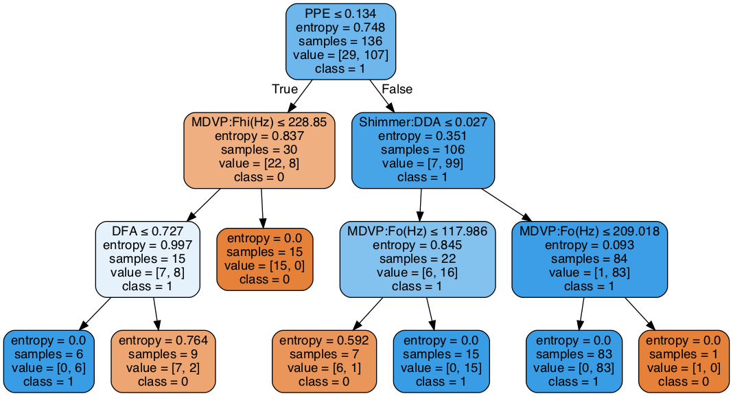
AM - Decision tree for Parkinson’s data: Given a voice recording data point we can go through the decision tree and be able to decide if the person has or not Parkinson’s Disease
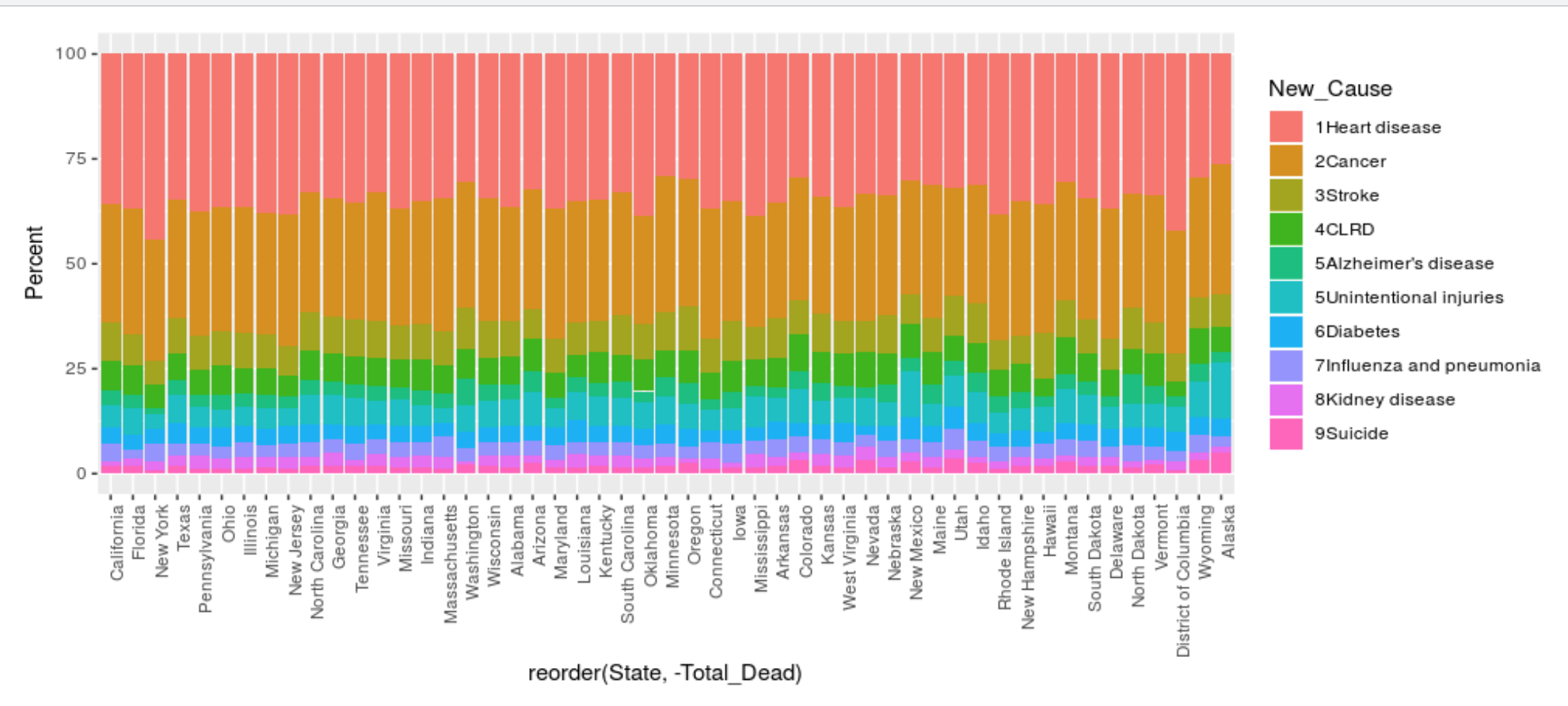
CC - This is my favorite because I worked the hardest and the longest to finish this visualization. The ordering of the biggest cause of disease to the lowest was difficult. The visualization is also useful in understanding the percent of total deaths caused by which death.
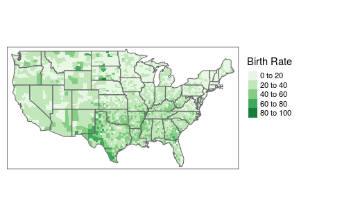
DZ - Below is the teen birth rate out of 1000 females between the age of 15-19 by county. Notice that in the south the teen birth rate is higher. This is my favorite visualization because this is the first map I have ever made.
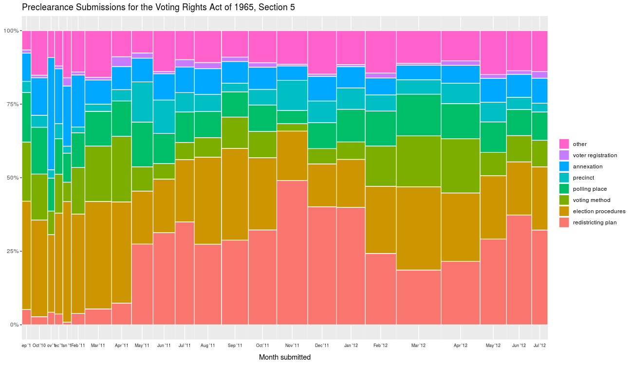
EB - The mosaic plot below demonstrates the U.S. nationwide proportion of the most common preclearance notices submitted in each month between September 2010 and July 2012. I observed a statistically significant correlation between the counts of redistricting plan notices and of precinct change notices. Meanwhile, there was none such between the counts of redistricting plan notices and of election procedure changes. Finally, observe the dearth of notices before the early months of 2011—recall that 2010 was a Census year and that population affects districting map requirements. Thus, the fact that notices (specifically, of redistricting plans) increased soon after this event makes intuitive sense.
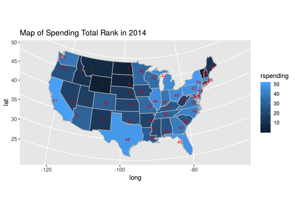
EN - The map below shows the spending trend thorough United States of healthcare spending in the year 2014. States are ranked from the lowest amount spent to the highest amount spent. We can see that California is the state that spent the most on healthcare in 2014.
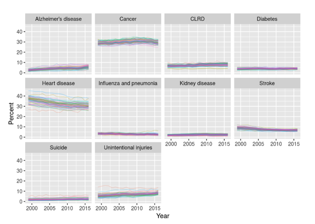
GO - The graphs below show the incidence of various causes of death over time for each state, is my favorite data visualisation that I made during this boot camp. One reason is because of the work it took to tidy the data, which added to the feeling of accomplishment. Additionally, I feel as though the data trends are very clear to see, including that heart disease has the largest variance and percentage killed, and the general trends of the data.
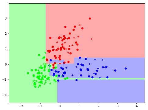
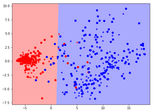
HK - Below was the result of the python project using Decision Trees. For attribute selection measures, Gini index was used. This picture show the weakness of Decision Trees since the selection process uses horizontal and vertical classification, it has boxes that do not coincide with our intuition. Classification is not smooth which means boundaries are not clear.
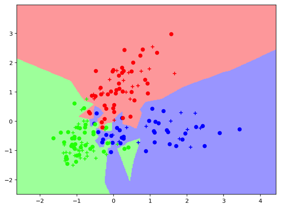
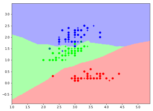
J and N - This is our favorite graph because we spent a crapload of time trying to get the PCA to work from hand and this is a very accurate picture of the classification of the data based on an SVC classification of the data.
JX - It’s the best testing score we had.
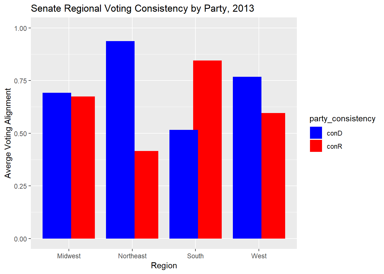
NC - This plot compares how consistently the average support of a vote among senators in a given region aligns with the average support of a vote among senators in a given party, averaged over all votes in the given term of congress. For example, the position of Northeast senators algins strongly with the position of Democratic senators, but weakly with Republican senators. I like this plot because it’s a simple visualization of a large amount of aggregate data.
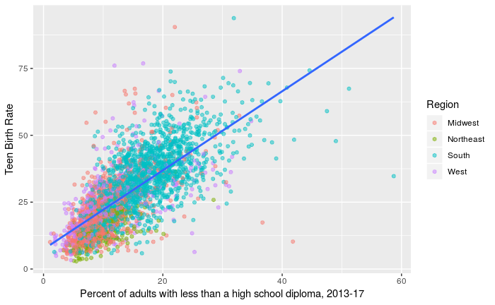
RJ - We also plotted teen birth rate against other measures of education level, but saw the strongest relationship against percent of adults with less than a high school diploma. This suggests that graduating high school acts as a barrier to teen births.
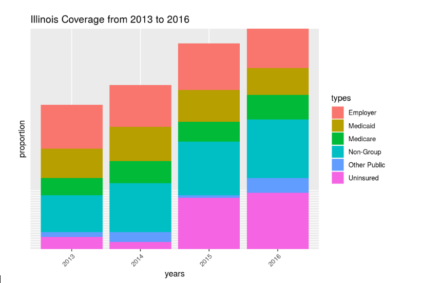
SP - This stacked bar chart exhibits the Health Insurance coverage in Illinois from 2013 to 2016. The height of each bar represents the number of individuals.
VV - Below is the measurement of the three types of wines involved in the wine dataset utilizing the KNN algorithm with K = 1 with respect to (X =) color intensity and (Y =) proline.